Wednesday, June 12, 2013

EDITING CHOICES


BLUE TINT

I added a blue tint to my images to add relevance to my myth and editorial title 'Sea Salt'. 
I really liked this because it almost transforms the backdrop into a deep blue sea. I also played around with the hue and saturation to make the models skin more pale and glowing. I think this gives an etherial look to the model, relevant to a siren. 


LAYOUT INSPIRATION


I looked to my chosen magazine RUSSH for guidance with my layout design. After flipping through a number of issues I discovered a few distinct layout styles that are distinctly RUSSH and would work well in my own magazine.


OVERLAPPING IMAGES

This is usually seen in the contents or trend forecasting pages. They tend to keep their overlapping of images quite neat, to stay in tune with the magazines overall style. They do this by giving their images a white boarder to separate their ideas. I think this could be effective with my contents page as I can give my reader a number of clues to what they are going to see as well as create a complimentary design.


BALANCE OF NEGATIVE SPACE AND TYPOGRAPHY

Russh usually include this type of design in their fashion and beauty editorials. I think the simplicity is really effective in getting a concept across.  In the example below the size and alignment of the typography perfectly balances out the photograph. The text size is effective in planting the concept straight into the readers mind, unlike other magazines that have this quite small.


SQUARE GRIDS AND FILLED TEXT BOX'S

This is usually used in Flat Lay, Depth of Field and 'Shopping' Pages. I have applied this neat style in my flat lay inspiration pages and tried to keep a very minimal style to my other pages. I think this style is effective and clear.

Something else that I have noticed and have gravitated towards is the magazines use of filled text boxes. In order to draw attention to information, RUSSH uses a white fill to their textboxes. This is generally used in Advertorials, Fashion Forecasting/ Trend Reviews. It is a clever way to separate text from an image and keeps to RUSSH's grid style.


Wednesday, May 29, 2013

RAW IMAGES


The images below are the ones I was happy with and could use. Of course I need to add some cropping, lighting and colour alterations. There are just the minimum of 6, I did struggle to find images. I decided to take a few images of the ocean and combine this in my editorial feature to add images as well as heighten my concept.


POSTER INSPIRATION


CLIENT STATEMENT

As our band is an alternative-pop band, our street poster will be targeted at an audience of both males and females aged between 17-30, as this is the audience that the band makes their music for and the poster will be showcasing this new duo and the style that they have undertaken. 


SILHOUETTE IDEA

The Silhouette of a bird is a popular symbol that is reflected throughout textiles, tattoos, jewellery and ornaments, consumed by Devlin’s target market. The depiction of a bird also strong relates back to our chosen myth. Below are a few images I could illustrate silhouettes from. I want to insert my own image behind the silhouette that reflects a similar look and texture to a bird. 


MIRRORING AND DUPLICATING STYLE

When researching, I stumbled across these album covers for the band Ginger & The Ghost, which has a similar style to DEVLIN and also falls under the Alternative Pop category. I think the mirroring editing technique and the control of opacity is really effective in guiding the eye to a focal point. 


POSES


For the individual photographs I wanted to capture the model in a complacent position with a direct vision. Similar to the images above, this type of pose creates a nerving emotion that something bad is going to follow. I want the model to appear as if she is concentrating on something. I think this is very powerful and reflective of our concept:  'A malicious beauty that captures her audience'.


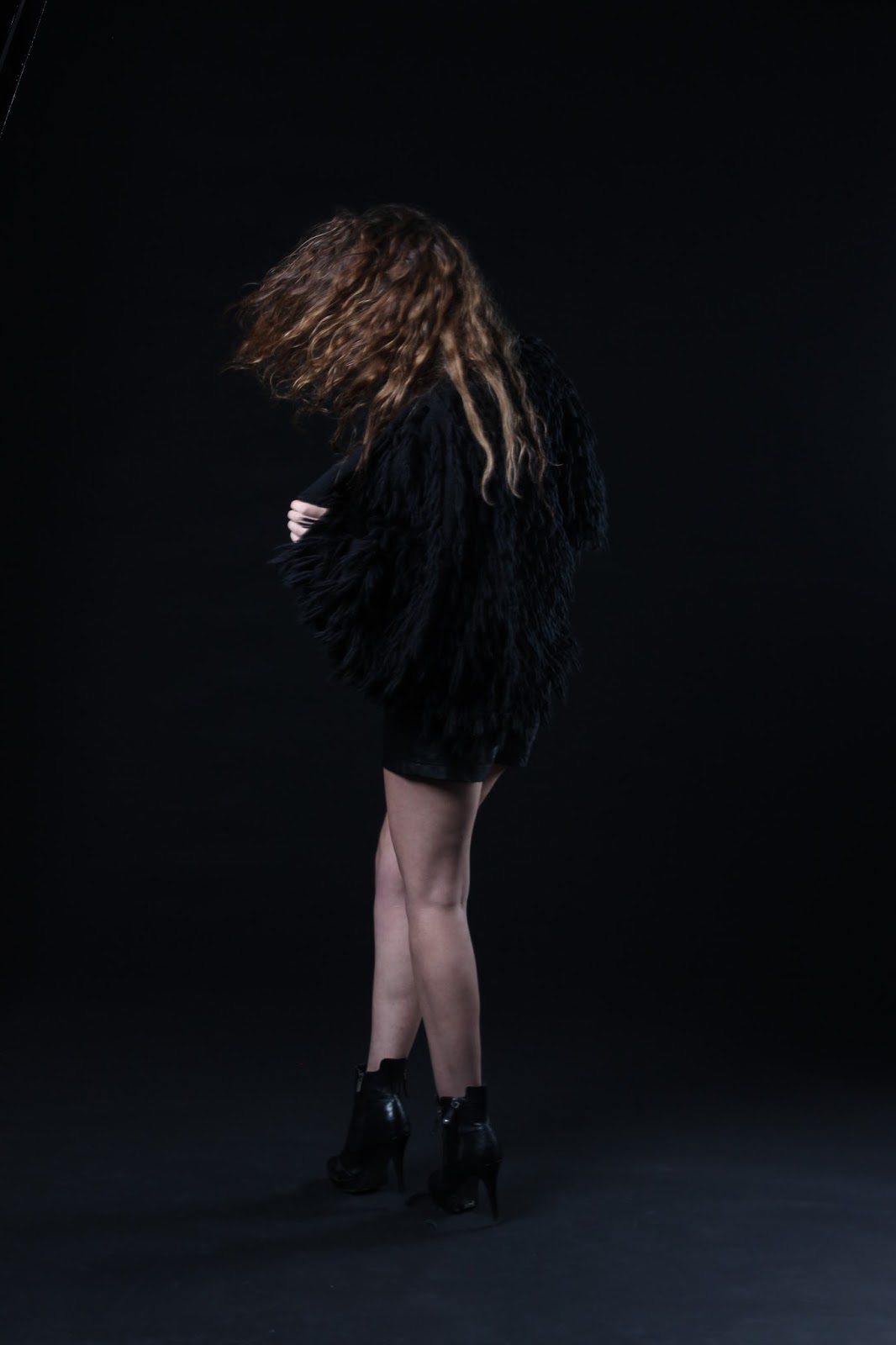
I think the pose in the image above, is reflective of a bird spreading its wings. The movement of the coat is also really beautiful and compliments the garment. I think this is pose is strong in suggestive the siren myth as it evokes a sense of power, freedom and influence. For the photographs of the girls together, I want them to seem as if they are on the same team, with their own style and power though. 

LOCATION SCOUTING

SOUTH WARF


We thought the lines and shape of this wood construction on South Warf could be a great location to shoot the band poster. The wood also reflects materials used in sail ships and is suggestive of the siren myth.


SOUTHERN CROSS STEPS


The second location we looked at was the southern cross steps. We liked the perspective of the steps as well as their raw colours and rough cement texture. We also thought the steps could be great for a range of different poses and compositions as we can place the models in perspective. 


SOUTHERN CROSS WINDOWS


We also liked the mysterious lighting of this window through in Southern Cross. The shadows created are beautiful, however this is only created at a certain time of day and the city in the background is irrelevant and miss leading from the concept.

Thursday, May 9, 2013

MAKEUP INSPIRATION & ALTERING OF BAND MEMBERS

MAKEUP

MODEL 1 - JACINTA

We decided that this type of blue makeup for the eyes would be effective for our siren story as it reflected the colour of the sea, as if her skin was mirroring the sirens surroundings. I like the gradient and mixture of varying blues as it compliments the colours in the eye. 


MODEL 2- JEN


For Jen we decided to go with the purple eye shadow and to have it slightly on her cheeks and forehead to mix it up a bit. Personally I wouldn't have chosen these makeup styles but the majority of my group liked this.

If it was soley up to me.. I would have gone with something like this....


This style is more in tune with our magazines, more on A/W trends and I think with the lighting we had it would have been really effective in highlighting her eye and making it more alien/creature (SIREN) like.


MODEL CHANGE

We have had trouble as a group on deciding the right style and model for the male role in our band. We eventually decided that using two female model's would be more effective in reflecting our story.  We wanted to steer away from the possibility of creating mens magazine like poses, and because of the seductive nature of our story, we were worried this may occur, with the inclusion of a male.


^ ^ ^ AVOID THIS  ^ ^ ^